


Fabric Color Trends for 2027 Collections: What Bulk Buyers Should Be Stocking Now

The 2027 color story is warmer earth tones (think terracotta and brick), deep saturated aquas, a bolder version of red, and color-shifting iridescent finishes for eveningwear and performance niches. Bulk buyers should start allocating warehouse space now to brick and aqua base cloths — they carry the lowest risk and longest shelf life — while treating iridescent and ultra-saturated red as smaller, faster-turn bets. Waiting until spring 2027 forecasts hit retail floors means paying rush freight and losing margin to buyers who committed six months earlier.
Why 2027's Palette Looks Different From the Last Three Years
Notice how the last few seasons leaned heavily on muted neutrals and pastel washouts? That cycle is ending. Color forecasting groups and mill sample books for late 2026 are already showing a swing toward saturation — warmer earth tones, deeper jewel tones, and finishes that actually catch light instead of absorbing it.
This isn't a random guess. It follows a predictable pattern: after 3-4 seasons of muted color fatigue, buyers and consumers both start craving contrast again. The last time this happened was around 2019-2020, right before the saturated color boom that dominated early pandemic-era loungewear. History doesn't repeat exactly, but color cycles rhyme.
What This Means for Your Purchase Orders
If you're still ordering the same beige and dove-gray base cloths you stocked in 2024, you're about to be behind. Not catastrophically — neutrals never fully disappear — but your reorder ratio should be shifting. Aim for roughly 60% core neutrals, 25% trend-forward saturated colors, 15% experimental finishes for 2027 planning.
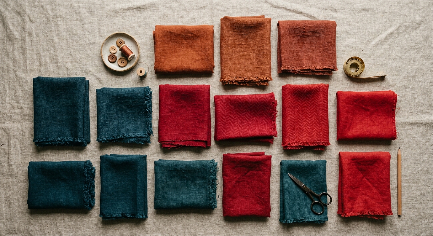
Brick and Terracotta: The Safest Bet on This List
Brick and terracotta tones are the lowest-risk stock decision for 2027 because they've been building momentum for two straight seasons already — this isn't a sudden trend, it's a slow-building one, which makes it far more durable than a flash color.
These warm earth tones work across an unusually wide range of end uses: loungewear brands love it in heavyweight French terry for hoodies and joggers, home décor buyers want it in canvas and upholstery-weight cloth, and workwear brands are picking it up as an alternative to standard olive and navy. Check the brick fabric line for base cloth options that already carry this tone in multiple weights.
Real-World Example
A mid-size activewear brand we work with shifted 20% of their spring loungewear order from heather gray to terracotta French terry last quarter. Their pre-orders on the terracotta SKU outsold gray 3-to-1 within the first two weeks of launch. That's the kind of signal that should move your next PO.
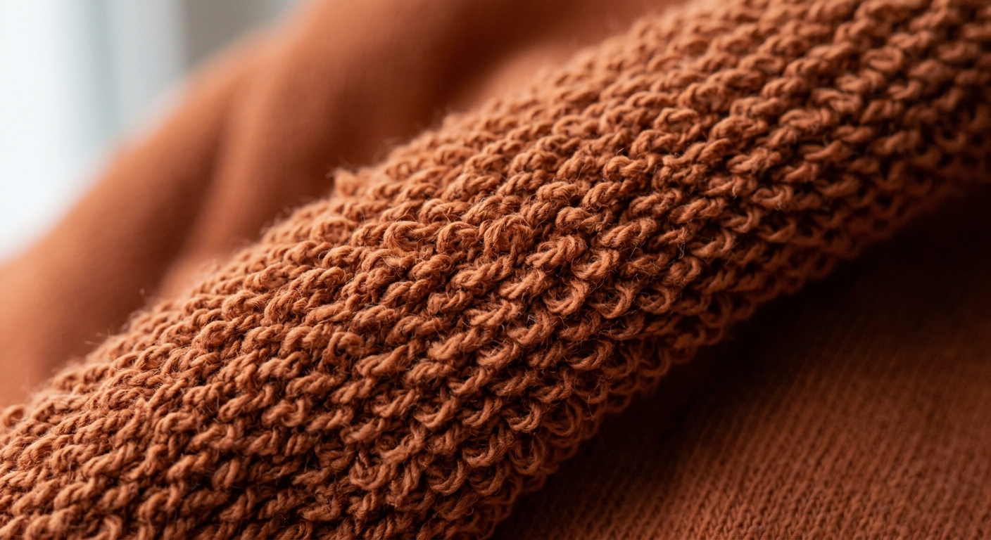
Deep Aqua Is Replacing Millennial Pink
Deep, almost teal-leaning aqua is stepping into the space that soft pastels have occupied for years. It's a cooler, more sophisticated statement color, and it photographs exceptionally well in both matte and satin finishes.
The smartest applications right now are outerwear linings, eveningwear, and swim/activewear crossover pieces. A satin base in this aqua family reads as elevated rather than costume-y — worth exploring in the satin fabric range for evening and bridal party lines. For cooler-weather goods, this same tone works surprisingly well in sherpa fabric as a lining pop inside outerwear — buyers are using it as a visible cuff or hood lining detail rather than an all-over color.
If you're unsure whether a specific mill's aqua will hold up across dye lots, this is exactly the kind of color where dye lot variance becomes a real financial risk. Deep saturated colors show mismatch far more visibly than neutrals do.
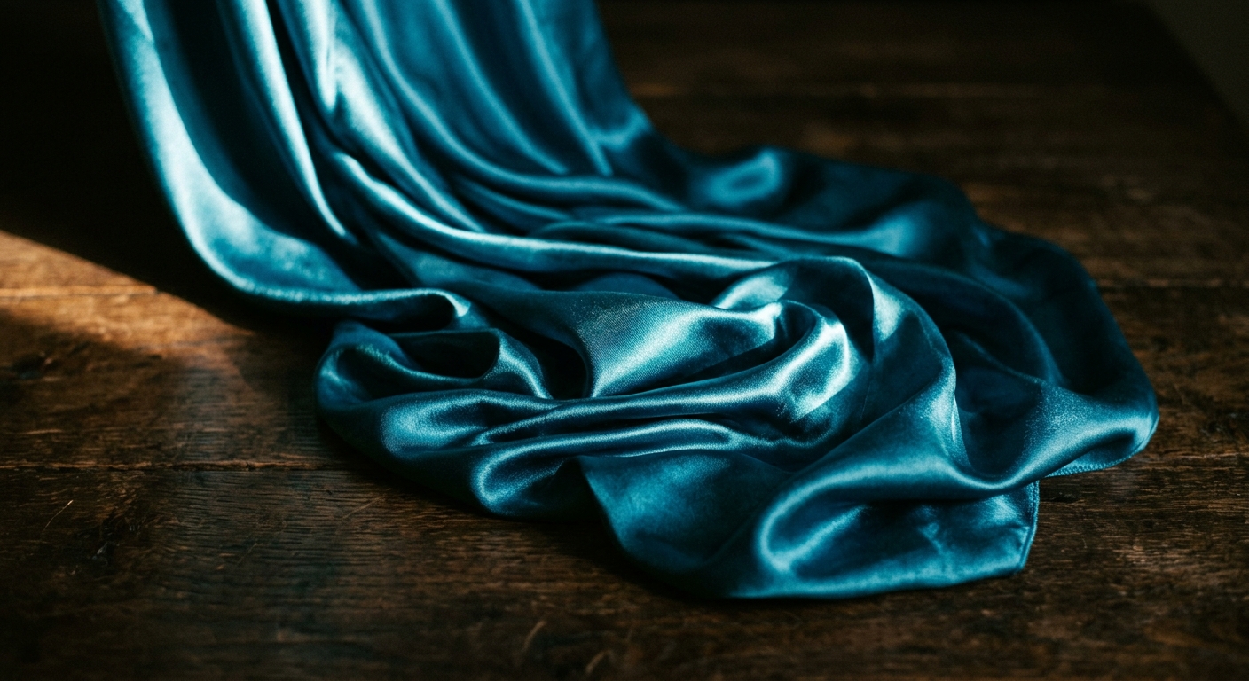
Red Is Back, But It's Not Christmas Red
The red trending for 2027 isn't the bright primary red you'd associate with holiday collections — it's a deeper, slightly brick-adjacent red with more brown undertone. Think brick red's more saturated cousin, not fire-engine red.
Where It's Landing First
Outerwear brands are using this tone as a statement color for puffer jackets and structured coats. Accessory brands are pulling it into faux leather goods — bags, belts, small leather-look accessories — where the deeper undertone reads as premium rather than seasonal. The faux leather fabric line and the core red fabric collection both carry variations worth sampling before you commit to a large run.
One caution: because this red skews deeper and warmer, it's more sensitive to lighting and dye process than a standard primary red. If you're comparing natural versus synthetic dye processes for durability, our breakdown on how fabric coloring affects fading and durability is worth a read before you lock in a large order.
Iridescent and Color-Shift Finishes: High Reward, High Risk
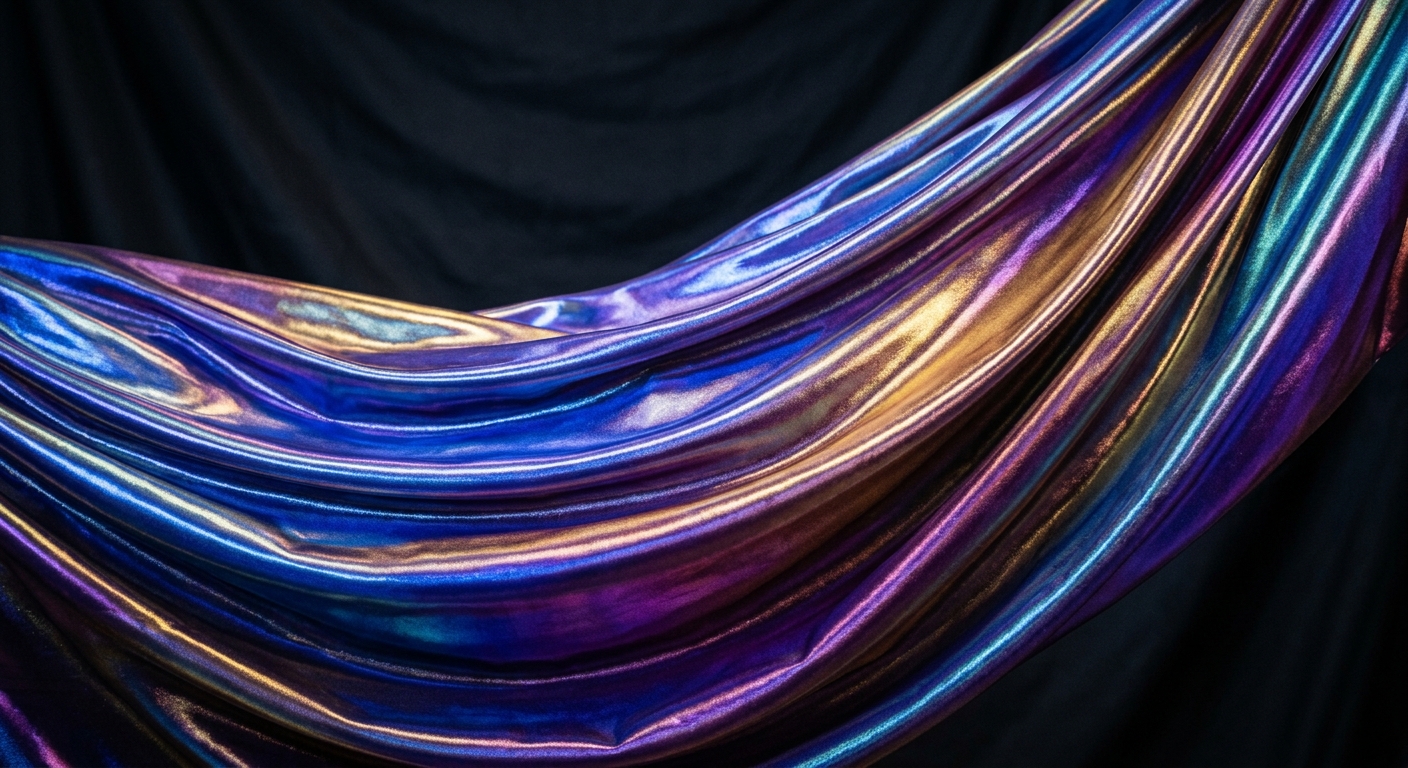
Color-shifting, iridescent finishes are the riskiest bet on this list — and also the one with the highest margin potential if you time it right. These fabrics aren't for core basics; they're for capsule drops, costume lines, dancewear, and festival-adjacent apparel where customers actively want something that photographs differently depending on the light.
The demand here is real but narrow. Dance studios, costume designers, and small festival-wear brands are consistently reordering iridescent fabric in small-to-mid volumes rather than one giant seasonal buy. That's the pattern to mirror in your own purchasing — smaller, more frequent orders rather than one massive commitment you might get stuck with.
A Buying Mistake to Avoid
Don't order iridescent fabric the same way you order a core basic. A buyer who stocked 3,000 yards of a single iridescent colorway last year ended up sitting on 40% unsold inventory when the specific shade fell out of favor after one season. Trend colors in this category need MOQ flexibility — worth reviewing our MOQ negotiation playbook before placing a large trend-color order.
How to Size Your Trend Color Orders Without Overbuying
Here's a rule of thumb that's saved more than one buyer from a warehouse full of unsold inventory: for any color that's trend-driven rather than core, order enough to cover 8-10 weeks of projected sell-through, not a full season. Reorder from there based on actual sell-through data, not forecast optimism.
Before you finalize yardage, run your numbers through a proper calculation rather than gut-feel estimating — our guide on calculating exact fabric yardage walks through the math so you're not over-ordering a color that might not repeat next season.
If you're building a smaller capsule around one or two trend colors rather than a full line, pairing them thoughtfully matters more than volume. Our post on picking five fabrics that actually work together applies directly here — a terracotta and deep aqua pairing, for instance, reads as intentional and current rather than random.




 Login with Google