-

Free Samples!



Digital vs. Rotary Screen Printing: Matching the Method to Your Order Size, Design, and Fabric

Table of Contents
Digital printing wins when the run is short, the design carries many colours or gradients or engineered placements, or you expect to reorder on demand, because its setup cost does not multiply with colour count and its price per yard barely moves with volume. Rotary screen printing wins when the run is long, the artwork uses a handful of flat colours, and the same design will run again and again, because the fixed cost of screens and engraving gets spread across far more yards. Then fit the method to the cloth as well as the budget: fine detail dies on loop terry, and heavy paste can stiffen a 60gsm dotted Swiss into something that stops behaving like the fabric you sold.
Key takeaways
- Rotary's fixed cost multiplies with colour count while digital's does not, so a fourteen-colour floral and a two-colour stripe cost roughly the same to set up digitally.
- Crossover yardage equals the fixed-cost gap between the two methods divided by the variable-cost gap, which means it changes with every artwork. Ask printers for setup and running cost separately to find yours.
- Design geometry can veto a method before price matters: a rotary repeat must divide evenly into the screen circumference, and every engineered placement needs its own screen.
- Ink follows fibre. Reactive for cotton, acid for nylon, silk and wool, disperse for polyester, pigment bound to the surface for everything else, and the post-treatment decides the hand feel you actually ship.
- Lock the base cloth first. A 180gsm cotton-poly terry, a 320gsm cotton spandex French terry and a 370gsm heavyweight take the same artwork to three different places.
The Four Variables That Actually Decide It
A lot of print decisions get made backwards. Two quotes land, one looks a few dollars a yard cheaper, and the order goes to the cheaper one before anyone has checked whether the artwork can run on it at all. Then the strike-off comes back with a repeat that will not divide into the cylinder, or a photographic gradient flattened into visible banding, and the saving disappears in a week of emails.
Four variables decide this, and they do not carry equal weight.
Run length and colour count set the money. Rotary carries a fixed cost before the first saleable yard: a screen for every colour, engraving, mounting on the machine, and the registration waste burned while the colours are brought into line. Digital carries a fixed cost per design file: preparation, colour separation, proofing. That block does not grow when you add a fifteenth colour.
The variable cost moves in opposite directions. Rotary's cost per yard falls as the run lengthens, because the fixed block is divided by more yards. Digital's stays close to flat. A run of twenty thousand yards does not get cheap digitally. It becomes a large digital invoice.
Design geometry and substrate behaviour can veto a method no matter how good the price looks. A twelve-colour photographic print and a four-colour flat stripe are not the same job. Neither is either of them on 100gsm openwork versus 370gsm loop terry, where the surface swallows fine lines and the ink load changes the drape.
Two questions worth settling before you request a single quote: will this exact artwork run again, and will my buyer accept the sharpness and the colour that the cheaper method actually delivers? If the first answer is no and the second is uncertain, the spreadsheet is not the deciding document.
Order Size: Finding Your Own Crossover Point Instead of Guessing
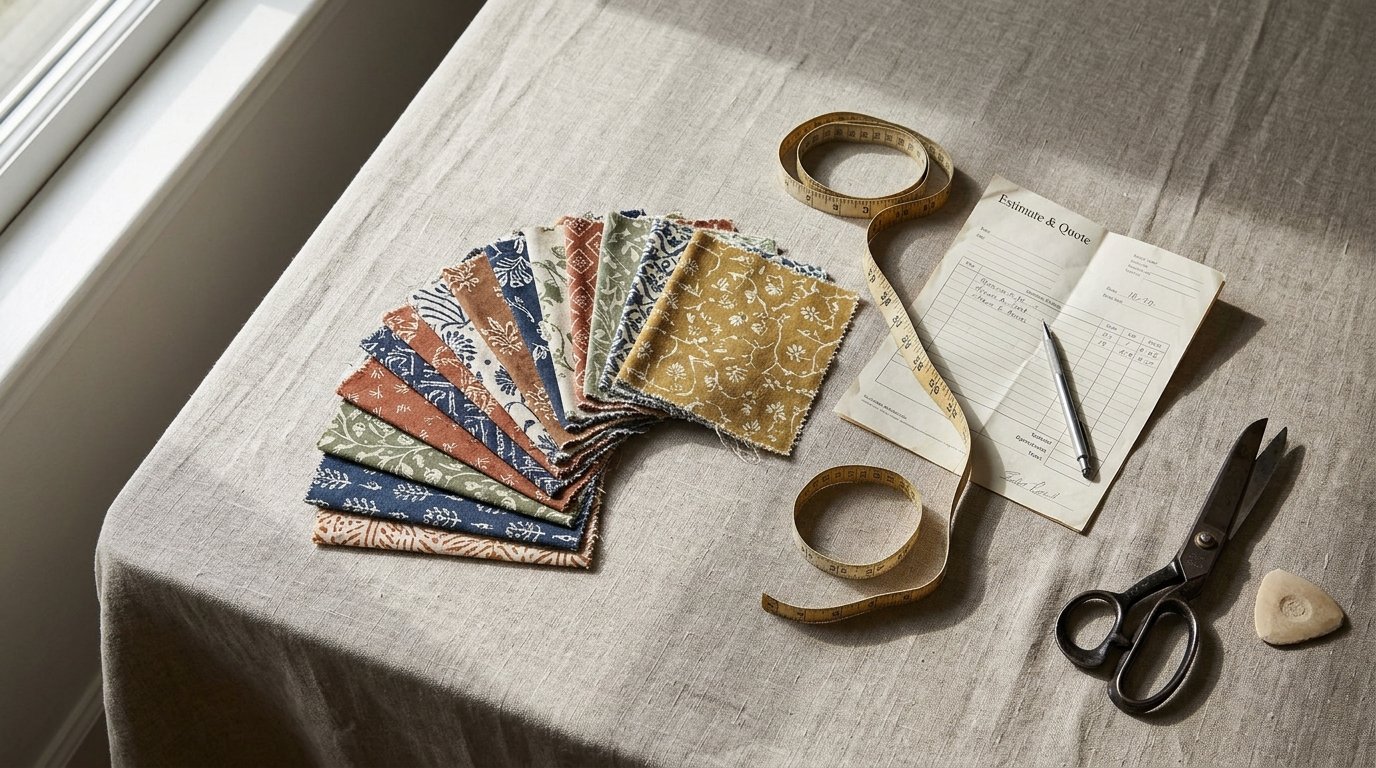
The crossover point is arithmetic, not folklore. Total cost is the fixed setup plus the variable cost per printed yard multiplied by yards. Set the two methods equal and solve, and you get the crossover: the fixed-cost gap between them divided by the variable-cost gap. Ten minutes in a spreadsheet, provided the printer gives you two numbers instead of one blended one.
- Ask for setup and running cost separately. Most printers quote a single price per yard, which hides exactly the two figures you need. Ask for the fixed block and the per-yard run rate on the same email, and ask what each covers.
- Ask for the minimum chargeable yardage in the same message. Below that floor the rotary option cannot be booked at any price, so the comparison stops there. The minimum exists because screens and makeready time have to be paid for, not because printers dislike small customers.
- Run the arithmetic per artwork, not per supplier. Rotary's fixed cost scales with colour count, so a three-colour design crosses over far earlier than a ten-colour one on identical yardage. There is no single crossover point. There is a crossover for that design on that cloth at that printer.
- Model run two and run three. Screens and setup survive while they are still serviceable, which lowers the effective fixed cost of the repeat order. Digital reprints with no screen inventory, but it will not reward you with a volume break either.
- Price the inventory you are about to own. A long rotary run buys a lower price per yard by handing you a large stock of one print. Put a cash and storage figure against the unsold yardage. Dead stock is the most expensive fabric a buyer holds.
Imagine a brand running a three-colour chest print on a mid-weight French terry, reordering every eight weeks. On the first order the screens are a genuine cost and digital often looks competitive. By the fourth reorder those screens have been paid for and are still serviceable, so the rotary price per yard has dropped while the digital price has not moved. The crossover happened somewhere in the middle, and it was not on the day the first quote was written.
Colour Count: Where Rotary's Economics Break and Digital's Limits Show
Rotary's cost structure is why colour count matters so much. Every colour is a separate cylinder screen, a separate registration point and a separate chance for the print to drift across the full width of the cloth.
Digital costing runs on ink volume and file preparation, not on the number of named colours. A fourteen-colour floral and a two-colour stripe cost roughly the same to set up. The moment a design creeps past six or seven colours, rotary's fixed block stops being a rounding error and becomes the biggest line in the quote.
What colour count actually costs in rotary
Registration error shows up as white gaps or a coloured halo at motif edges, most often on fine linework where two screens meet. The more screens in the sequence, the more yards get consumed in makeready before saleable cloth comes off the machine, and that waste is charged to you one way or another.
Rotary paste lays down a thicker, more opaque film, which is why it covers dark grounds so convincingly and why a two-colour stripe fabric programme that repeats every season is rotary's home turf. Digital on the same black ground usually needs a white underbase or a pigment route, and the underbase changes both hand feel and cost.
The work digital does better
Continuous tone, soft blends and photographic gradient are native to digital. Rotary can engrave a halftone screen, but that screen is frozen once made, so a revision to the artwork means new screens and a new fixed cost. Metallic, fluorescent and heavy special effects are a screen and paste conversation; never assume a digital quote covers them.
One thing both methods share. If a logo or trim colour has to match a reference under retail lighting, fix the colour standard and the tolerance in writing. Neither method fails more often than the other here. Both fail quietly.
Design Geometry: Repeats, Placement and What Fits on a Screen
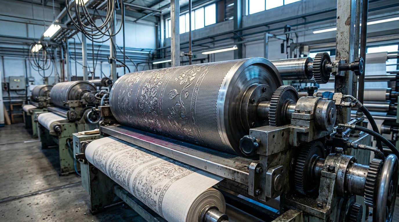
Rotary screens are cylinders with a fixed circumference, and the repeat has to divide evenly into it. Get the printer's available circumferences before the artwork is finalised. A repeat that does not fit means rescaling the design, settling for a scale you did not intend, or commissioning a screen that will not run on the machine you booked.
| Criteria | Digital printing | Rotary screen printing |
|---|---|---|
| Best run length | Short to mid runs, on-demand reorders | Long runs, repeating seasonal programmes |
| Setup cost driver | One cost per design file | Cost per colour: screen, engraving, mounting |
| Cost per yard at volume | Near flat, no volume break | Falls as the run lengthens |
| Colour count impact | Minimal, 14 colours costs like 2 | Multiplies fixed cost per screen |
| Engineered placement prints | Cheap at low volume | One screen per placement |
| Dark-ground coverage | Needs white underbase | Thick opaque paste |
| Fine detail on loop terry | Holds small type better | Pile blurs thin lines |
| Artwork change on reorder | File edit, no new tooling | New screens required |
Engineered placement prints are the clearest split. A motif centred on the chest, a border along the hem, a placement panel: cheap digitally at low volume and expensive in rotary, because each placement needs its own screen and precise alignment to the cut. Allover repeats, half-drops and mirrored repeats suit both methods. The difference is that the rotary repeat is locked the moment the screen is engraved, while the digital file can be edited between runs without new tooling.
Watch the printable width. A motif wider than that width forces panel printing or a seam in either method, and the time to find out is before the tech pack is signed off, not after.
File hygiene for both routes: flat spot colours on named channels for rotary, a layered file with defined spot channels for digital, and the repeat size stated inside the file so nobody has to measure the print with a ruler at the machine. Place your design on the table, take only the viable column to the printer, and ask for a quote on that one.
What Printing Actually Does to the Cloth: Fibre, Stretch, Pile and Weight
A print that looks right in a proof can still ruin the cloth it lands on. The ink system has to match the fibre, and the surface plus the weight decide whether the print reads at all.
The ink system follows the fibre
Digital textile printing is not one ink. Reactive dye goes on cotton and other cellulosics, acid dye on nylon, silk and wool, disperse on polyester, and pigment binds to the surface of whatever the printer can pre-treat. The fibre dictates the ink, and the ink dictates the after-treatment.
Reactive and acid routes need steam fixation and washing afterwards. That wet processing is where shifts in hand feel, shrinkage and colour bleed come from. Pigment skips the wash but sits on the cloth as a binder film, which reads as a slight stiffness. Buyers describe that difference badly and complain about it anyway, so it pays to have the hand-feel vocabulary to name it in the tech pack.
Where the surface fights back
Rotary paste lays down far more material. On dotted Swiss, which typically runs 60gsm to 120gsm, heavy paste can stiffen the cloth and close the openwork the fabric exists for. On a 250gsm terry, the same paste load can be the difference between a print sitting on the loops and one that reads through to the back.
Stretch is rotary's registration problem. Spandex-containing knits move under tension between screens, so KF1195, a 320gsm (11.3 oz) 95% cotton 5% spandex French terry with a fine smooth hand feel at 25.99 a yard, or KF788, a 200gsm (7.1 oz) 68% cotton 27% polyester 5% spandex French terry at 19.99 a yard, needs tight tension control on a rotary line or it needs digital.
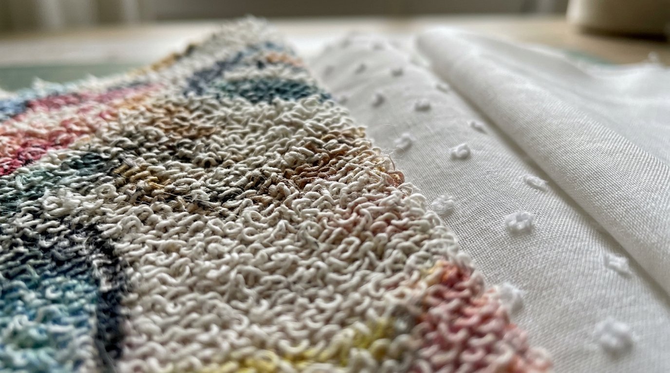
Pile and texture eat fine detail. Loop terry and a 250gsm terry such as KF784 blur thin lines and small type. Crisp surfaces hold them, which is why a mercerized cotton in the 160 to 200gsm band reproduces fine lines and small type cleanly. Mercerization is a caustic soda treatment applied under tension, and the resulting smooth, absorbent surface takes ink evenly instead of scattering it across the pile.
Weight changes the ink load
The same artwork lands differently on MQ43014 at 180gsm, KF620 at 230gsm, KF1358 at 320gsm and MQ43009-370g at 370gsm, all French terry from the same range. Heavy cloth back-stains when a printer pushes too much paste through to force a solid ground.
Canvas in the 200 to 500gsm band is usually pigment printed for bags, aprons and upholstery, where the print has to survive abrasion rather than repeated washing. Judge that strike-off by rubbing, not laundering. Preparation matters as much as the method: singed, desized, mercerized or heat-set greige prints cleaner and more consistently than loom-state cloth pulled straight off the loom.
Reading the Quote: The Line Items That Decide the Real Cost Per Yard
A digital price for fifty yards and a rotary price for five thousand describe two different jobs, so setting them side by side tells you nothing about which method is cheaper. The only figure worth arguing about is landed cost per finished, printable yard at your actual quantity, on your actual cloth.
- From the rotary printer, separately: screen cost per colour, engraving, mounting, makeready and registration waste expressed in yards, minimum chargeable run, and who owns the screens afterwards.
- From the digital printer, separately: file preparation and colour separation, proofing, the ink coverage the price assumes, pre-treatment, and post-treatment such as steaming and washing where the ink system requires it.
- The base fabric as its own line, from both. French terry in the 180 to 370gsm range is listed from 19.99 to 25.99 a yard: MQ43014 at 19.99, KF620 at 19.99, KF788 at 19.99, KF1195 at 25.99, MQ43009-370g at 25.99. Print is an add-on to a large number, so a small percentage difference in print price is rarely where the money sits.
- The items nobody quotes until you ask: colour-matching fees, screen storage between runs, reprint minimums, over and under delivery tolerance, and whether the printer keeps the screens or scraps them.
- Who absorbs finishing loss. If the printer delivers after a wash step, the yardage you receive can be shorter than the yardage you paid for. That gap belongs in your cost per finished garment, not in a footnote on the invoice.
Put both quotes on one sheet with the fabric line held constant, and add a column for the finishing-loss allowance so the gap is visible before you sign.
Approving the Print: Strike-Offs, Standards and the Tests Buyers Skip
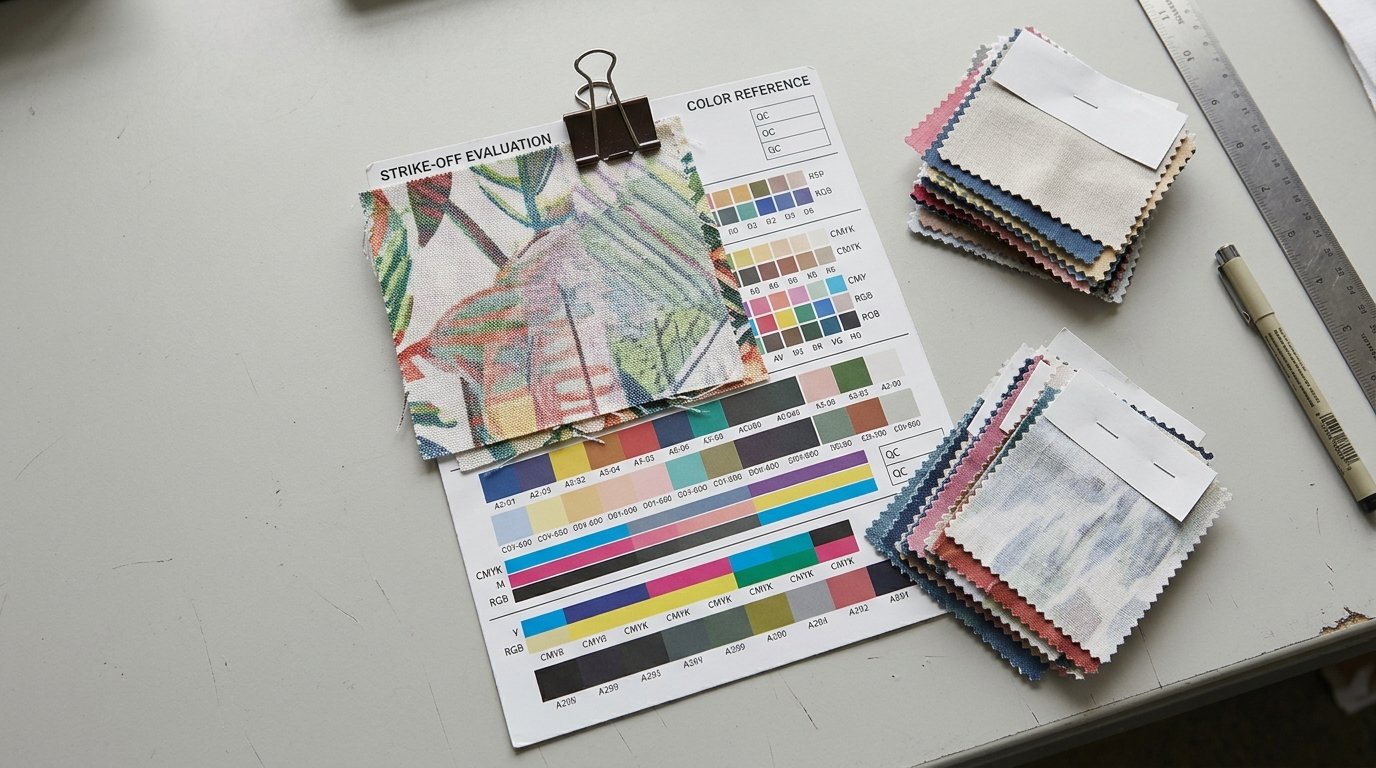
Approval is where cheap decisions get expensive. A lab dip approves a colour on a substrate sample. A strike-off approves the colour, the ink and the post-treatment on the actual cloth. Approve on the strike-off and nothing else.
- Match the base fabric exactly. Same fabric, same weight, same finish you will buy. Absorbency and surface texture change the printed result more than most buyers expect, and a proof on plain cotton tells you nothing about a loop terry.
- Judge it after the finishing step. The post-print wash moves hand feel and can shift shade, so a pretty unwashed sample is not evidence of anything you will ship.
- Test what your customer will do to it. Rub the print with dry and wet white cloth for crocking, check wash fastness, and for bags, aprons or upholstery check abrasion rather than laundering.
- Inspect registration at the seam allowance and at both selvedges, not just the middle of the piece. Edge drift is what customers photograph and post.
- View the cloth under the lighting your customer buys in. A shop floor, a phone camera and a warehouse lamp will disagree with each other, so know which one governs the approval.
- Keep the signed strike-off. It is the physical standard the bulk gets judged against, and without it every argument defaults to opinion.
- Write the standard down: colour reference and tolerance, repeat size, base fabric ID, ink system, and the acceptance tests. Anything not on paper is a future dispute.
Your Next Step: Lock the Cloth Before You Lock the Print Method
Print method should be the last decision, not the first. The cloth can eliminate a method the spreadsheet liked, and it can make a cheap print expensive once the strike-off fails.
- Choose the base fabric and weight first. Then quote on that exact cloth. Anything else is a quote for a different product.
- Do the crossover arithmetic with real setup and running numbers before committing to a long rotary run. Unsold printed yardage costs more than a slightly higher price per yard on a smaller batch.
- Order the swatches before anything else. Global Fabric Whole Sale offers free samples across a catalogue of over 10,000 fabrics sold by the yard, so the candidate base cloths can be compared by weight and hand in your own hands before any of them goes near a printer.
- Compare the shortlist on what changes printability: weight in gsm, fibre content, stretch and surface texture. MQ43014 at 180gsm, KF1195 at 320gsm and MQ43009-370g at 370gsm take the same artwork to three different places.
- Take a written spec sheet to the printer: fabric ID, weight, fibre content, the design file with a stated repeat, the colour standard, target yardage and the tolerance you will accept.
- If you are still undecided, run the strike-off both ways. The cheapest method on paper is not always the cheapest method on your fabric, and two proofs cost far less than one wrong production run.
Book the strike-off only after the base cloth is signed off, and keep a labelled retained sample of that exact lot sealed in the drawer. It becomes the reference your printer, your pattern room and any future supplier all match against, which is the only thing that settles an argument about colour or hand six months later.
Frequently asked questions
Is digital printing cheaper than rotary screen printing?
Only on short runs or high colour counts. Rotary spreads screen and engraving costs across a long run, so its price per yard falls as yardage rises, while digital stays close to flat. A short run with many colours usually goes digital; a long run of flat colours usually goes rotary. Get setup and running cost quoted separately so the comparison is real.
Can you digitally print on French terry and other loop-backed knits?
Yes, but the pile flattens detail. Small type and fine lines sink into the loops, so artwork needs bolder shapes and wider spacing. Stretch also has to be controlled on the press, and reactive inks on cotton require steaming and washing afterwards, which shifts hand feel. Approve a strike-off on the exact terry weight you intend to buy, not on a plain cotton proof.
What is the minimum order for rotary screen printing?
It varies by printer, machine and colour count, and no single figure applies across the trade. The minimum exists because screens, engraving and makeready time have to be paid for, so it climbs with the number of colours. Ask each printer for their minimum chargeable yardage on your specific artwork and treat that number as your floor.





 Login with Google